

项目名称:深圳“爱上の茶”奶茶店设计
Project Name:Design of “Fall In Love With Tea” Milk Tea shop in Shenzhen
主设计师:彭建
Chief designer:Peng Jian
参与设计师:周城林 陈冠
Participating designer:Zhou Chenglin Chen Guan
设计说明:
客户的消费群体定位是:思维活跃,追求时尚,有好奇感和渴望度,并且力图于时代前列去领导消费新潮流的年轻群体。
这个群体会因为店铺的时尚程度,店铺的装修风格是否吻合他们与生俱来的时尚淑媛气质等因素而发生冲动性消费。
所以这个奶茶店的设计要符合年轻群体的潮流,正如当下正流行的ins风,我们通过双方提供的元素图确定色彩,主色彩为:黑+白+灰+局部点缀粉色和玫瑰金。局部使用是避免粉红过多很显得档次较低。
Design note:
The customer's consumer group positioning is: active thinking, pursuing fashion, curiosity and eagerness, and trying to lead the young people who are leading the new trend of consumption in the forefront of the times.
This group will have impulsive consumption due to the fashion level of the store, whether the decoration style of the store matches the innate fashion temperament and other factors.
Therefore, the design of this tea shop should conform to the trend of young groups. Just like the popular ins wind, we determine the color through the element map provided by both sides. The main colors are: black + white + gray + partial pink and rose gold. Partial use is to avoid too much pink and it seems to be lower grade.
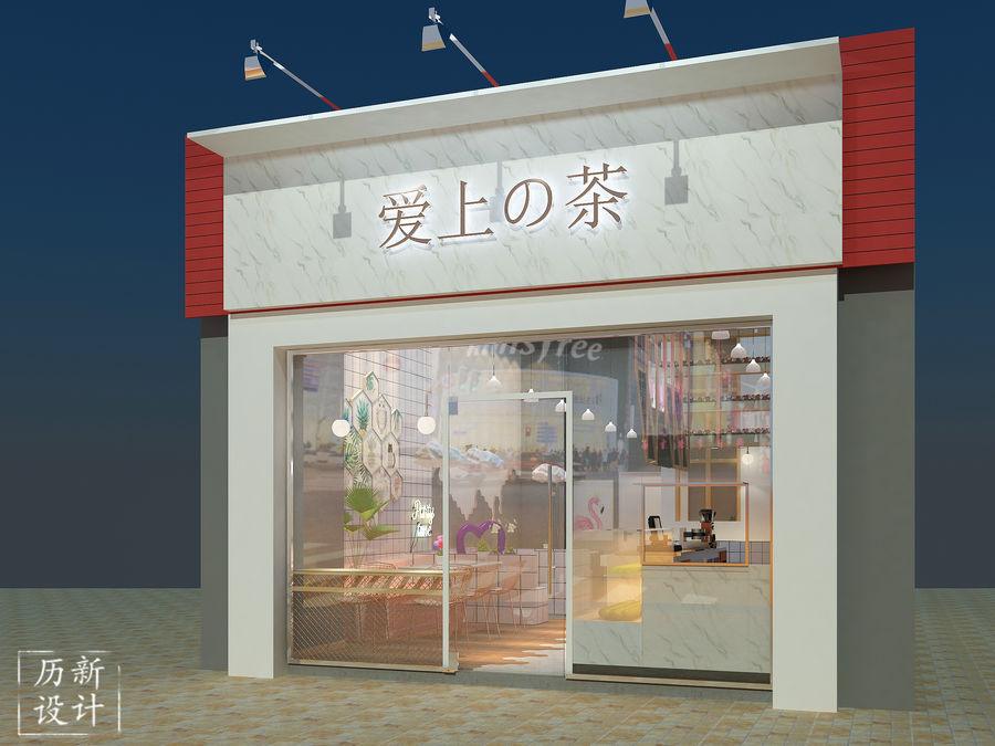
总体效果图。玻璃门的作用是使室内总体结构布局得以暴露在群众眼前,可以更加的吸引目光,使人驻足观看,从而达到了人流量的聚集;店铺logo颜色采用金色,简易明了,黑色纹理的白色大理石作为背景,可以更加突出。
Overall renderings. The function of the glass door is to expose the overall structure of the room to the eyes of the masses, which can attract more attention and make people stop to watch, thus achieving the gathering of people's traffic; the color of the store logo is golden, simple and clear, and the white marble with black texture is used as the The background can be more prominent.
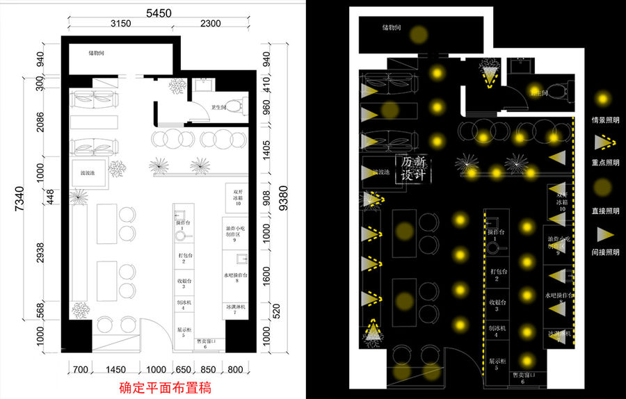
平面布置图以及灯光布置图
Layout plan and Lighting layout
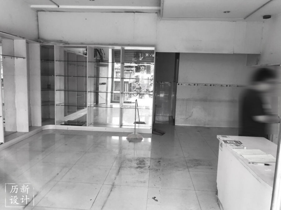
未改造前的现场图
Live picture before renovation
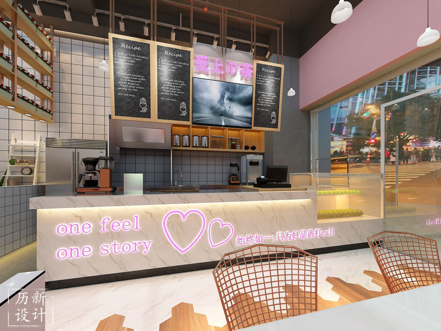
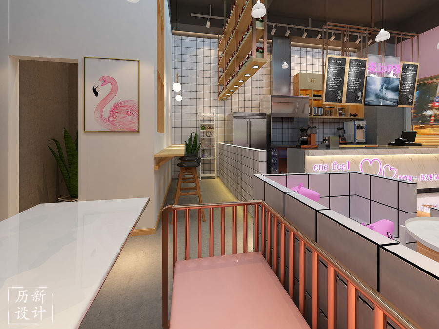
吧台是面向客户的,可以使客户看见全部的制作过程,小黑板和粉笔所写的字给人亲近童趣之感;白色大理石为背景,可以更加突出粉色的英文句子。
The bar is customer-oriented, allowing customers to see the entire production process. The words written on the small blackboard and chalk give people a sense of childlikeness; the white marble is the background, which can highlight the pink English sentences.
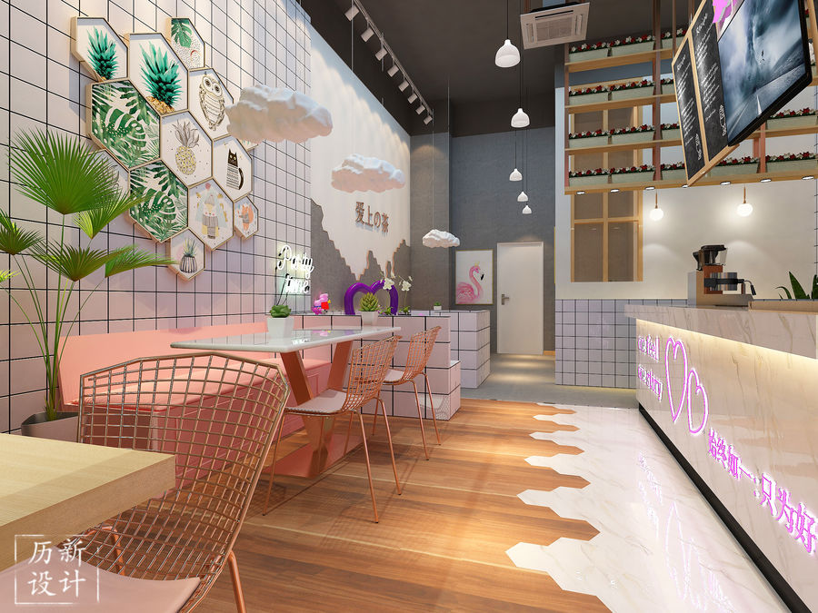
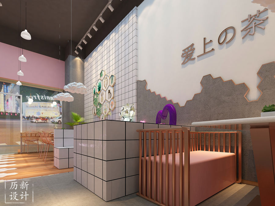
从视觉上来说,总体所有的色彩都巧妙的互相融合,墙壁一半采用黑白格子,另一半则是六角砖围绕着店铺logo,黑白格子所起作用就是简约时尚,六角砖则是造型美观,打造空间的精致感和文艺感;粉色的坐垫用到金属框架,是因为两者并不突兀,还能起到互相融合的作用;考虑整体风格所以采用了简单的白色吊灯和云朵装饰;六角砖组合的相框装饰墙面,提升空间雅致;其中放了绿色植物是因为可以使总体多一些生机,可以使客户感受到自然。
Visually speaking, all the colors in the whole are ingeniously blended together. The half of the wall is black and white, and the other half is the hexagonal brick around the shop logo. The black and white grid is simple and fashionable. The hexagonal brick is beautiful and creates space. The sense of exquisiteness and literary sense; the pink cushion uses a metal frame because the two are not awkward and can also be combined with each other; considering the overall style, a simple white chandelier and cloud decoration are used; The photo frame is decorated with decorative walls to enhance the elegance of the space; the green plants are placed because it can make the whole life more lively and make the customers feel the nature.
这是店内的另外一个角落,洁白干净的环境,温馨的灯光,还有别致的壁画。
This is another corner of the store, white and clean environment, warm lighting, and chic murals.
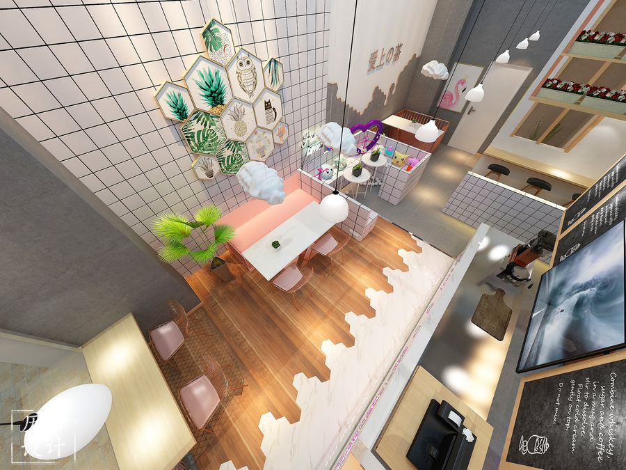
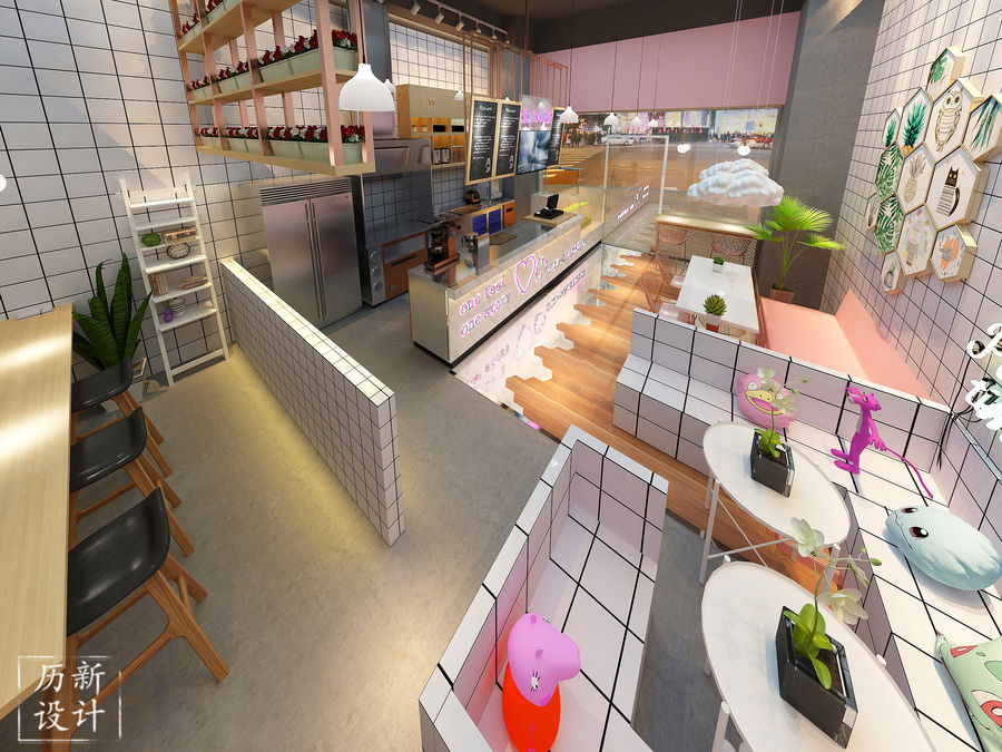
高空俯瞰的视觉开阔感。可以更清晰地看到店内采用了当下比较流行的装饰品,比如小猪佩奇、粉红豹,火烈鸟等,这些可以起到吸引众人的作用,引起众人的关注;总体采用的黑白格子突出简约和时尚;采用小柜子等装饰可以让人感觉到温馨,像是在自己家里一样。
The visual sense of openness overlooking the sky. It can be seen more clearly that the store's more popular decorations, such as the pigs, the pink leopards, the flamingos, etc., can attract people's attention and attract the attention of the people; Simple and stylish; decorated with small cabinets can make people feel warm, like in their own home.


评论(0)