

本项目位于室外广场,设计目标是将一间现代且前卫的咖啡馆引入一个原本传统而单调的区域。本案的性质介于外卖店铺和入座式餐厅之间,旨在结合两者的视觉美学:年轻文化的闪光之处和经典餐厅的扎实品质。自项目初创以来,设计都融入了日本设计的视觉特征,以衬映餐厅提供的日式甜点。
Located in an outdoor plaza, the goal is to introduce the cafe’s modern and forward presence to an otherwise traditional and subdued area. It is neither a grab-and-go cafe place nor a sit-down restaurant. It exists in the intersection of the two, and thus aims to combine the visual aesthetics of both; the brightness of the youth-led culture and the solid steadfast quality of a classic eatery. All the while, the design infuses visual traits of Japanese design to reflect the Japanese style dessert that it serves.
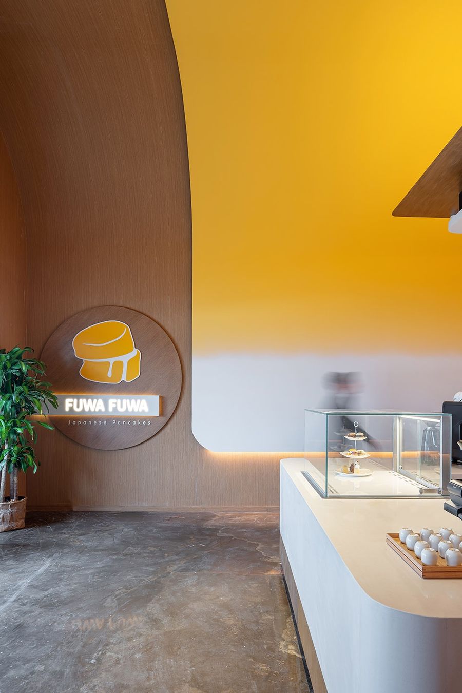
▼项目概览,overview of the project ©Scott Norsworthy
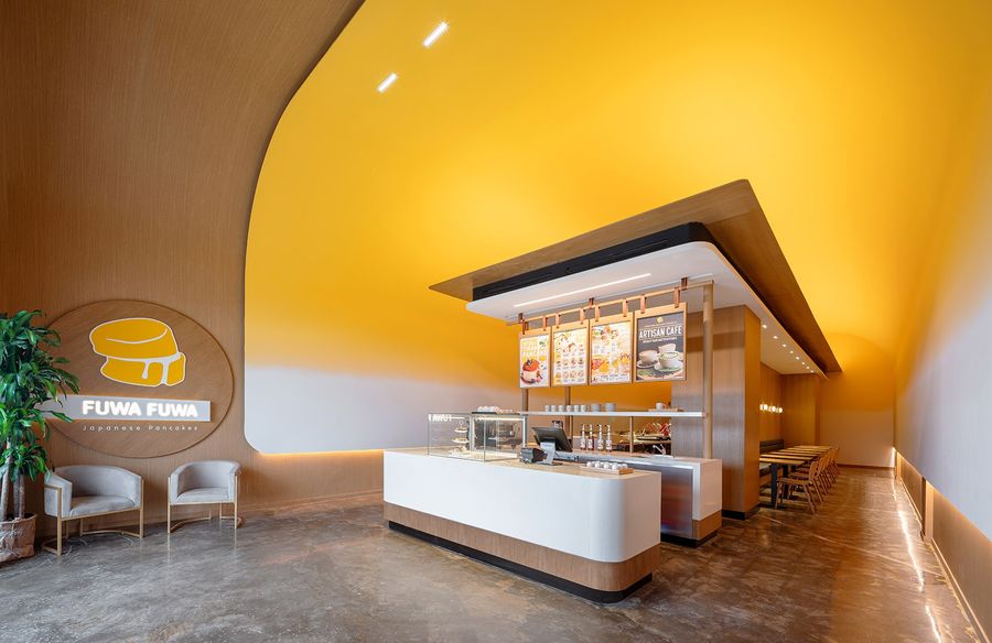
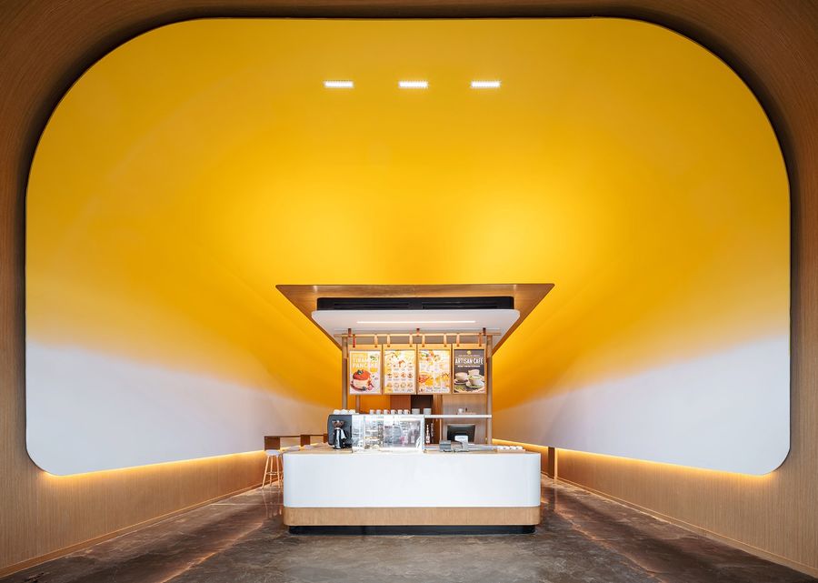
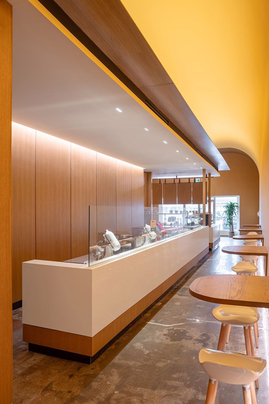
高耸天花板柔和的曲线和明亮的黄色映衬着现代寺庙般的结构,迎接游客的到来。光从天花散发出来,柔和地照亮了空间的各个角落。入口空间的两侧是走廊。
Visitors are greeted by the soft curve and bright yellow of the high canopy as it frames a modern temple-like structure. Light emanates from it, softly brightening all corners of the space.
▼高耸的弧形天花,a high canopy with soft curve ©Scott Norsworthy
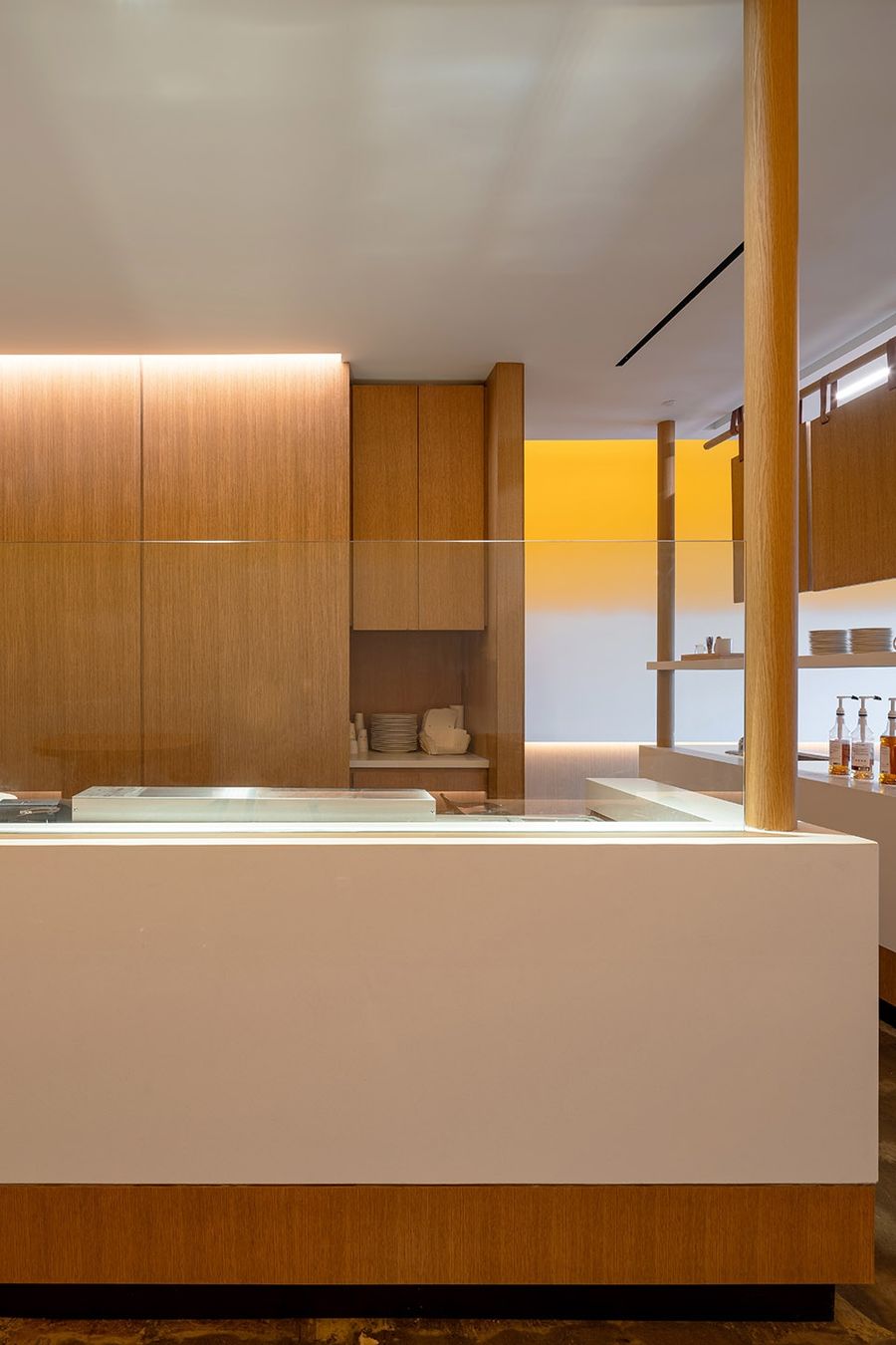
▼销售柜台,the counter ©Scott Norsworthy
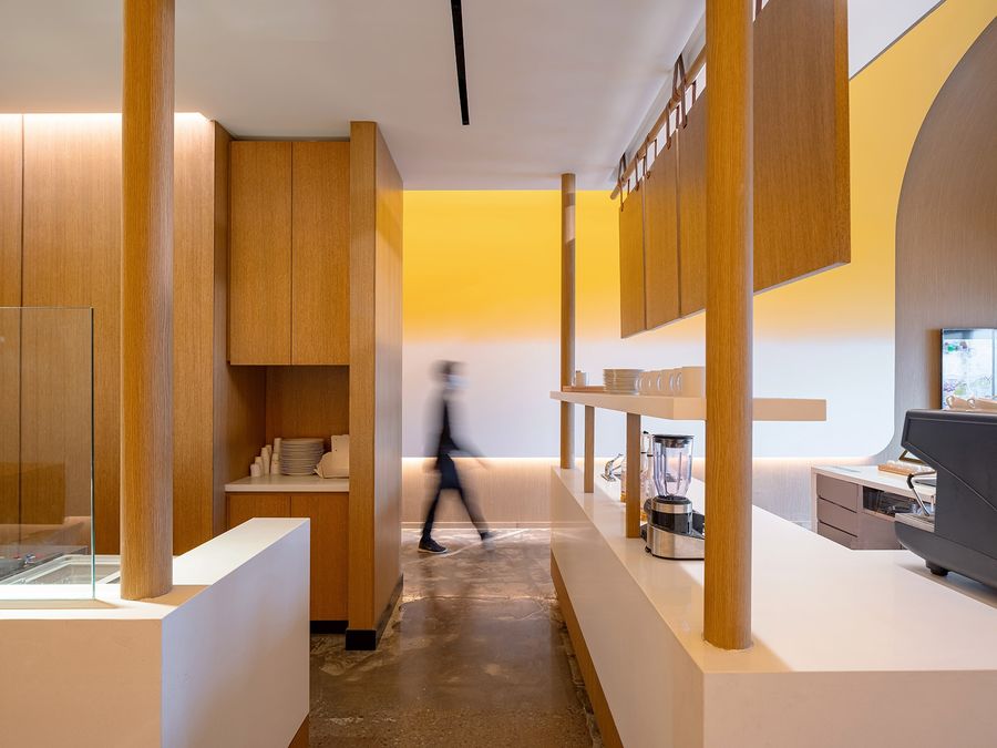
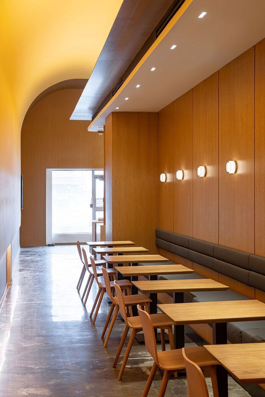
入口空间的两侧是走廊。进入走廊,客人可以得到两种空间体验:翻动煎饼的喧嚣烟火气和隐藏在一个小空间里的舒适氛围。
It is flanked by corridors on either side. By entering the side valleys, two experiences become available; the hustle and bustle of pancake flipping and the cozy feeling of being tucked away in a small pocket of space.
▼煎饼区域,pancake cooking area ©Scott Norsworthy
▼煎饼操作台近景,close shot of the pancake cooking bar ©Scott Norsworthy
狭长的168平方米空间内需要满足三个关键要求:送货/取货订单空间、店内顾客可以不受打扰地交谈和用餐的隐私空间,以及易于接近且高度可见的前厅。
The narrow and long 168 square meter space needed to fulfill three key requirements: a space for delivery/pickup orders, privacy for in-store customers where they can converse and dine undisturbed, and an accessible and highly visible front of house.
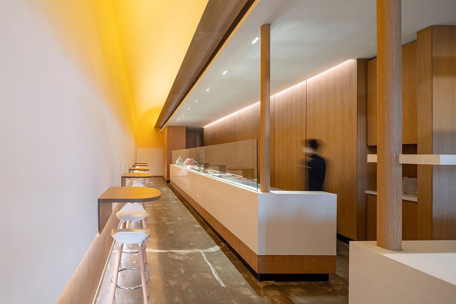
▼相对安静的坐谈区域,a quiet seating area ©Scott Norsworthy
疫情使外卖和送货变得更加普遍,因此设计必须考虑与交通流量相关的空间分配。如何最大限度地减少客户的出行?这个狭窄的空间如何以有机和被动的方式为不同的客户提供不同的空间?
The pandemic has made take-out and delivery more prevalent and it became essential to consider the distribution of space in relation to the flow of traffic. How can the travel of customers be minimized? How can this narrow space host distinct zones for different customers in an organic and passive fashion?
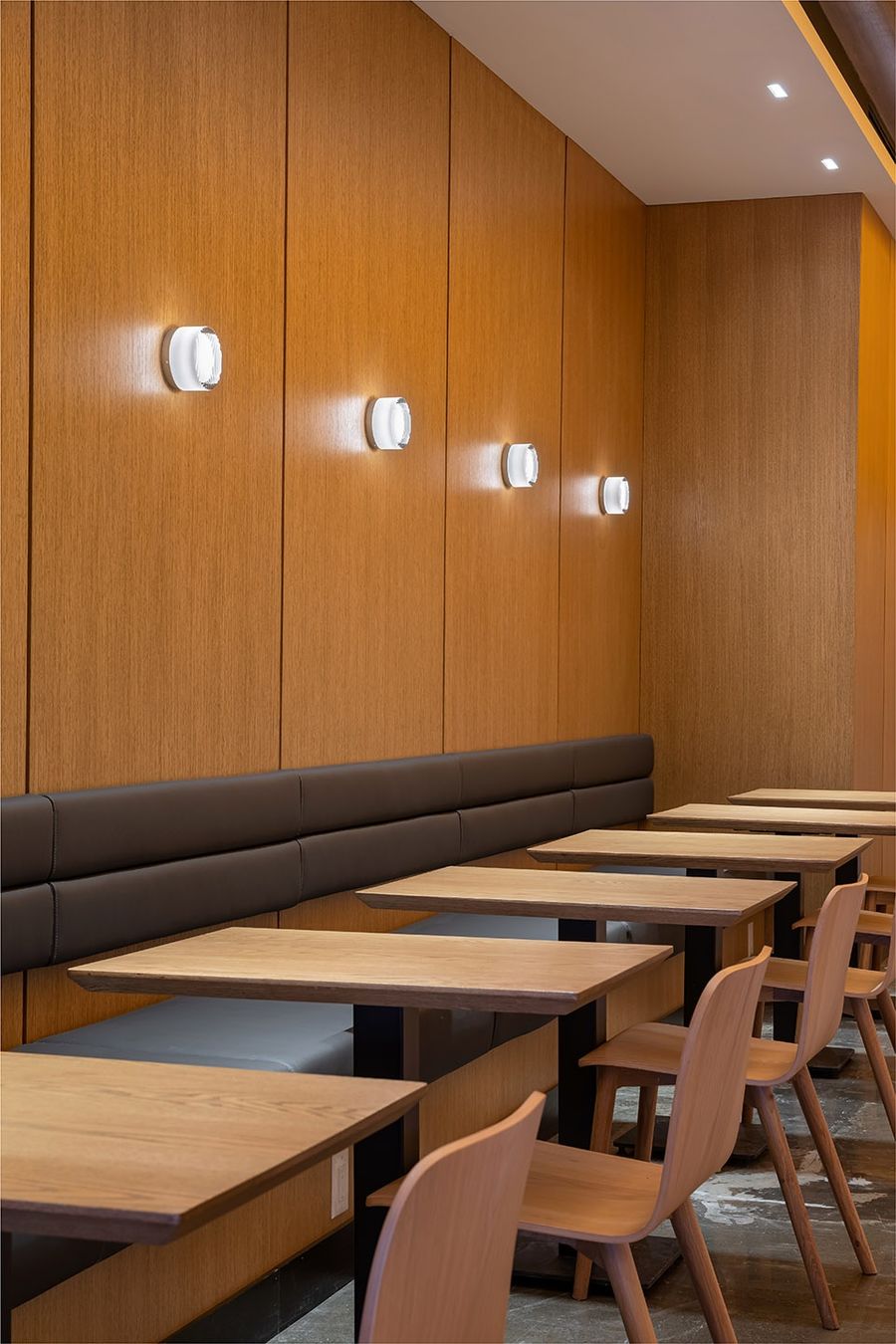
▼桌椅近景,close shot of the table and seats ©Scott Norsworthy
解决方案的形式是突出空间的长度,营造一种走在小巷街道上的感受。通过将销售柜台放置在弧形元素的前方,使其成为入口迎客空间,在两个对比区域之间创造了“内部和外部”之间的简单交流。
The solution came in the form of highlighting the length of the space and creating a feeling of walking down a side alley street. By placing the sales counter in the front of the curved element, it effectively becomes the entrance, creating a simple dialogue of “inside & outside” between two contrasting zones.
▼入口处的logo,logo at the entrance space ©Scott Norsworthy

更多相关内容推荐


评论(0)